One charting service gives a value of 189.55 for the 200-DMA of SPY and another gives a value of 190.50. This difference is due to the choice of data, adjusted vs. unadjusted, and an example of how the conclusions of various analysts may depend on the price series used.
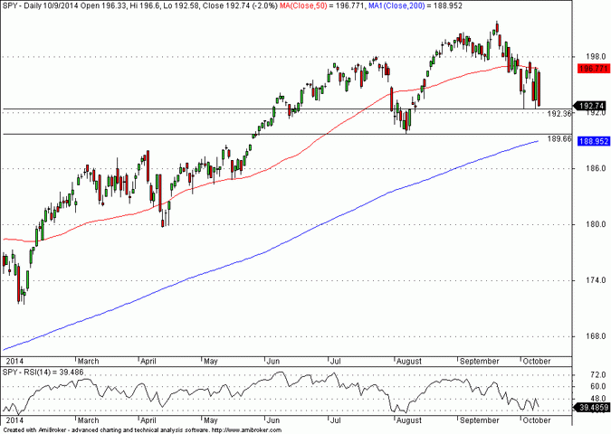
Below is a daily chart of SPY based on data adjusted for dividends (no splits in SPY):
The 200-dma is at 188.95, -1.97% below the last close, and below the August low, which is at 189.66. An example of a website that provides charts based on adjusted data is Stockcharts.com, which is widely used by technical analysts.
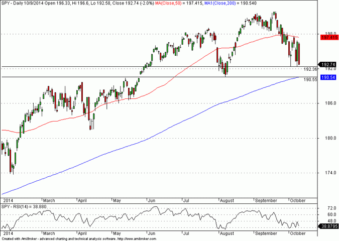
However, the unadjusted chart paints a different picture:
In the above chart, the 200-dma is at 190.54, -1.14% below the last close, and just one cent below the August low, which is at 190.55. This chart shows a major support level near 190.55 that is also a strong attractor of price. The website Finviz.com provides unadjusted charts.
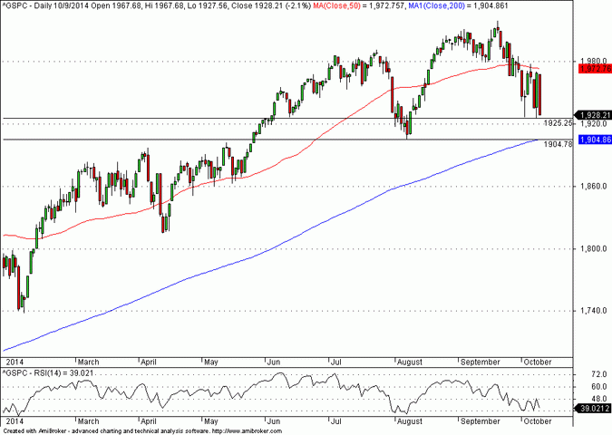
Note that the difference between the two distances of the close to the 200-dma is a respectable 0.82% in favor of the unadjusted data. But which is the best price series to use? There is no simple answer to this question as it depends on the particular situation and on objectives. In this case and in my opinion it is the unadjusted series because it agrees with the S&P 500 index chart price action, as it should:

You can subscribe here to notifications of new posts by email.
Disclosure: no relevant positions.
Charting program: Amibroker
Disclaimer
Related post


