Visual charting is plagued by confirmation bias and ambiguous reward-risk. Traders need more objective ways of identifying setups and calculating reward-risk than visual analysis of charts, which rarely works.
In this blog we have discussed several times the perils of charting and application of classical technical analysis. Actually, I have written a book that goes by the title Fooled by Technical Analysis: The perils of charting, backtesting and data-mining where I discuss not only the perils of classical charting but also of quant analysis.
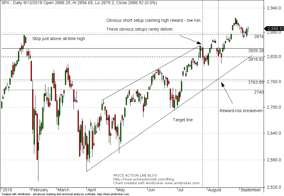
Last month a supposedly high reward-risk short setup in S&P 500 was proposed in Twitter by a respectable trader. I would like to use this setup as an example of what traders should avoid in general. Below is the chart that includes the particular setup which was a short in S&P 500 ($SPY) after the close of July 27, 2018, with stop just above the previous all-time high and profit target at the lower up-trendline shown.
The short entry was at the closing price of July 27, at 2818.82. The stop-loss was at, let us say, 2874, just above the previous all-time high and the target was at the lower up-trendline, let us say at 2740, for example.
The risk is 1.95% if the stop is hit and the reward is 2.75% if the target is hit. The ratio is 1.41, so this is not actually a high reward-risk setup to start with, even if the target is reached next day, something that is unlikely to happen.
This type of visual short setups suffer from time decay, just like options. As time passes and the market does no fall but moves sideways, the target is raised and at 2763.85, the reward-risk ratio becomes 1. Afterwards, the risk becomes larger than the reward. In the particular case, short traders did not have a chance as the market reversed direction and made new, all-time highs.
Visual charting can offer the illusion of high reward-risk setups where in reality there are none. This illusion is reinforced by wishful thinking. Anyone who trades this way will probably lose at the end. Quantitative approaches also suffer from their own problems but visual charting is doomed approach except in the case of a few experts.
For example, DLPAL LS software calculated a very small short bias for SPY after the close of July 27, 2018:
The short bias was only -2% (P-delta) and indistinguishable from noise, just like the visual chart setup.
Traders need to find more objective ways of calculating bias and reward-risk that minimize wishful thinking. This is a difficult task and requires investment in time, education and tools. Visual charting offers no edge, since there is no barrier to entry.
If you found this article interesting, I invite you follow this blog via any of the methods below.
Subscribe via RSS or Email, or follow us on Twitter
If you have any questions or comments, happy to connect on Twitter: @mikeharrisNY
Charting and backtesting program: Amibroker
Technical and quantitative analysis of Dow-30 stocks and 30 popular ETFs is included in our Weekly Premium Report. Market signals from systematic strategies are offered in our premium Market Signals service.
