In the last few days there have been hundreds of posts in financial social media with charts that show highest year-over-year increase in commodity prices in 40 years. This increase is an artifact of the commodity crash of 2020. Any claims linking this year-of-year increase to inflationary pressures should be carefully scrutinized.
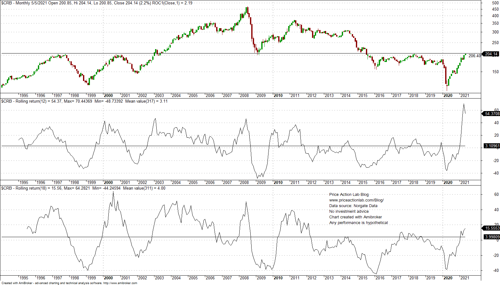
As the CRB index chart below shows, although year-over-year (12 months) rate-of-change of the index is highest since at least 1994, this does not hold for the 18-month rate of change.
The 12-month rate of change (YoY) is at 44.2% and much higher than previous peaks but 18-month rate of change is at 18% and much lower than previous peaks during 1996, 2001, 2004, 2008 and 2011, as shown in above chart.
Probably there will be some increase in inflation but no claims about sustained inflationary pressures can be made from looking at these charts only. The system is too complex to compress to one chart, as some financial analysts do. Furthermore, there may be no clear longer-term link between commodity price increases and inflation.
These YoY charts are often hype. By this I do not mean inflation will not occur but only refer to the fact that these charts are not conveying any useful information related to complex macroeconomic variables.
Disclaimer: The premium articles are provided for informational purposes only and do not constitute investment advice or actionable content. We do not warrant the accuracy, completeness, fitness, or timeliness for any particular purposes of the premium articles. Under no circumstances should the premium articles be treated as financial advice. The author of this website is not a registered financial adviser. The past performance of any trading system or methodology is not necessarily indicative of future results. . Read the full disclaimer here.


