Compressed long-term charts with linear scale can offer the illusion of a vertical bubble market. Those are used frequently by some permabears to scare investors.
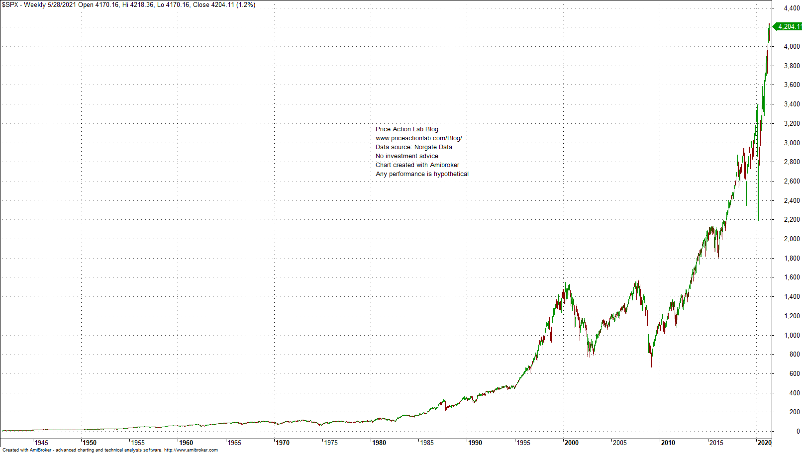
Below is an example based on recent social media post from a permabear: S&P 500 chart with linear scale.
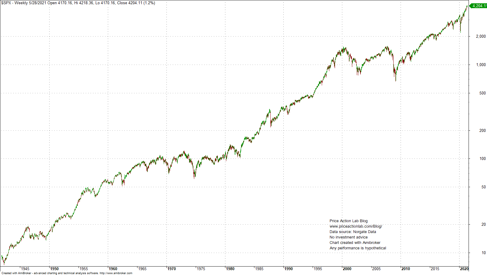
Especially after 2020, the index appears to move nearly vertically. However, when proper log scale is used, there is a different picture.
Log scale allows comparing relative changes since log(Price[k]) – log(Price[k-n]]) = log(Price[k]/Price[k-n])
It may be seen from the above chart that the uptrend after 2020 is not much stronger than uptrends in the 60s, 80s and 90s.
Another way to put the difference between linear and log charts is that former reflect absolute distances but the latter reflect percentage changes. Therefore, 20% changes, for example, will appear the same on the chart regardless on the starting and ending prices.
Some permabears take advantage of the fact that linear charts exaggerate more recent changes in an effort to support a narrative about bubble market. As the log chart above shows and based on price action only, there is no major difference between recent price action and price action in past during strong uptrends.
Disclaimer: No part of the analysis in this blog constitutes a trade recommendation. The past performance of any trading system or methodology is not necessarily indicative of future results. Read the full disclaimer here.
Charting and backtesting program: Amibroker
Data provider: Norgate Data
If you found this article interesting, you may follow this blog via RSS or Email, or in Twitter

